An Ko Rau

An Ko Rau,世界语中“恒动”的意思,有循环和持续的含义。很多人通过标识来认识安高若,建立印象,因此安高若希望新的标识能够建立品牌和朋友之间的联结。
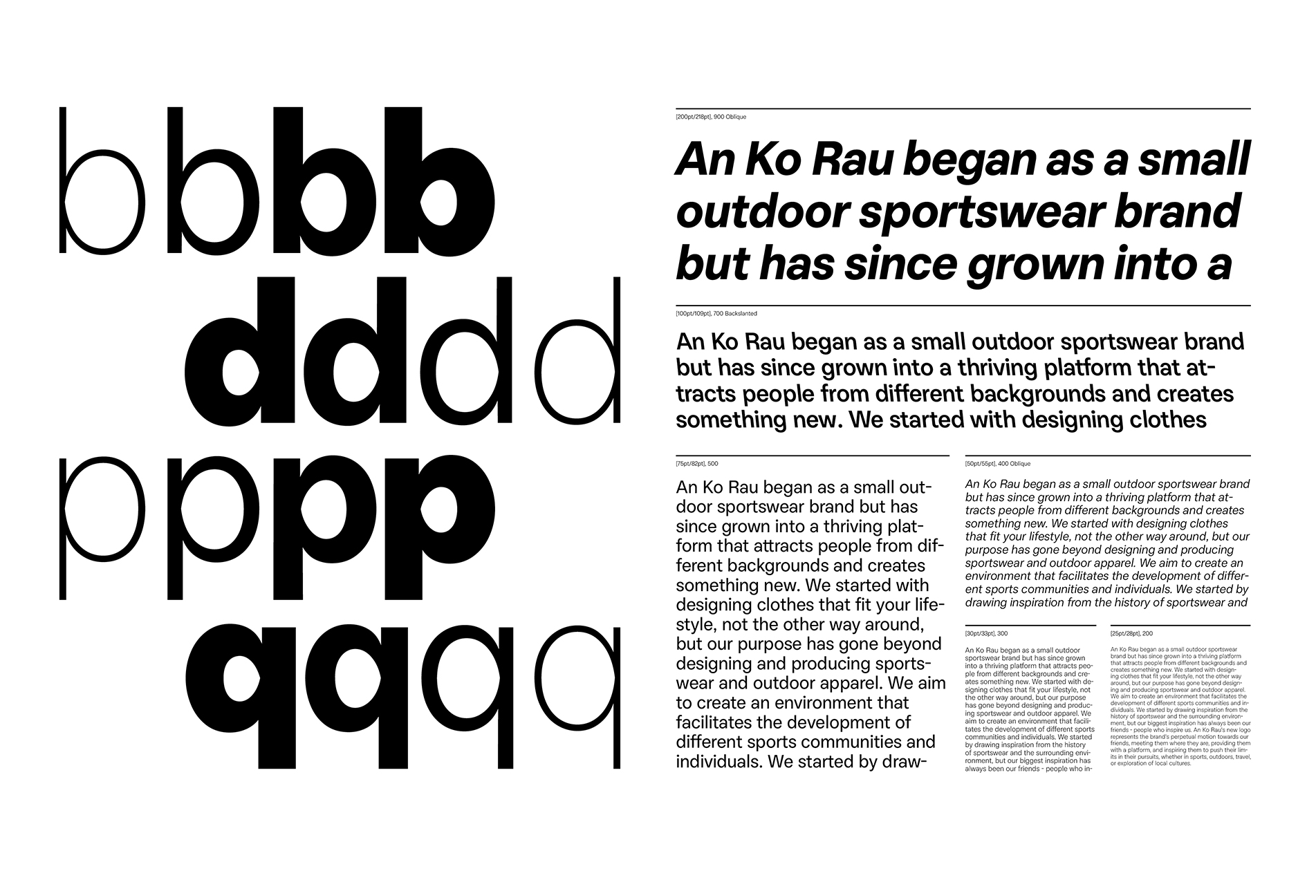
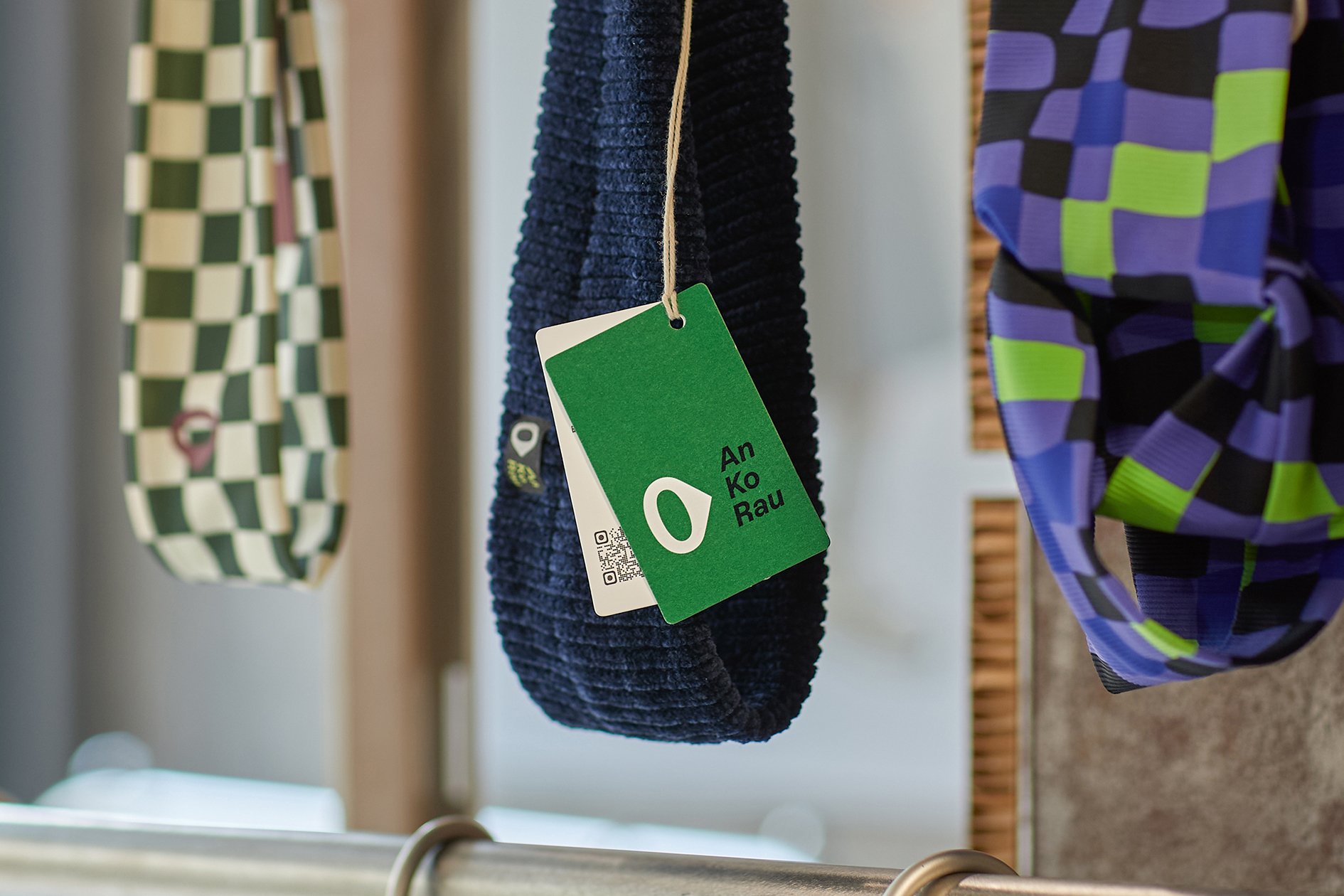
quinsay design 的工作为安高若的图形标识带来更完美的比例和新鲜的色彩,以及一款全新的品牌字体——An Ko Rau Sans,让字体标志、屏幕和印刷品上的信息看起来更加“An Ko Rau”,同时带来更好的信息阅读体验。新字标以及字体中的 a,字母内腔与安高若 logo 图形有着相似的轮廓,具有向前运动的指向性。
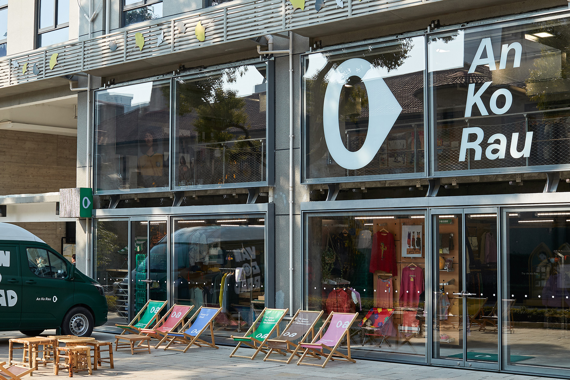
quinsay design 对安高若整体的品牌视觉也进行了系统性的优化。我们将安高若图形 logo 调整为更舒适的比例,设定了新鲜气息的新品牌标准色,以及全新的字体标志。新的主 logo 组合方式由长条形改为块状,块状 logo 让图形和字标同时变得鲜明,具有“真实”与稳定感,带来图形与字母在对比中产生的趣味。升级后的品牌视觉也体现在产品、包装等全方面的应用设计中。
An Ko Rau, meaning "perpetual motion" in Esperanto, conveys a sense of circulation and continuity. Many people recognize An Ko Rau through its visual identity, forming their first impression of the brand. Therefore, An Ko Rau hopes that its new identity can establish a stronger connection between the brand and its audience.
Quinsay design has refined An Ko Rau’s visual identity with improved proportions, fresh colors, and a brand-new typeface—An Ko Rau Sans. This custom typeface enhances the readability of text across logos, screens, and print materials, making the information feel even more “An Ko Rau.” Notably, the letter “a” in both the new wordmark and the typeface mirrors the contours of the An Ko Rau logo, creating a forward-moving dynamic.
In addition to typography, quinsay design has carried out a systematic optimization of An Ko Rau’s overall brand visuals. The logo has been adjusted for more balanced proportions, a new signature color palette has been introduced, and the wordmark has been refreshed. The primary logo format has also shifted from a horizontal layout to a block-like composition, making both the symbol and the wordmark stand out more distinctly. This new structure enhances the sense of authenticity and stability while introducing a dynamic contrast between the graphic and the logomark. The upgraded brand visuals are now applied comprehensively across products, packaging, and other design implementations.
Art Director: Tong Yi
Designer: Tong Yi / Bao Sanchuan
Year: 2023
Client: An Ko Rau