Shardaa

shardaa 夏达夏达是一家源自 Himalaya 的藏地新兴品牌,致力于将高原生活智慧与现代化创新设计理念相融合,为大家介绍动态更新的藏地文化。shardaa 来自 ཞབས་དག།(藏语中是干杯的意思)的发音,干杯不仅有庆祝、合作、祝福等美好含义,也代表着人与物、人与人、人与空间的亲密互动。
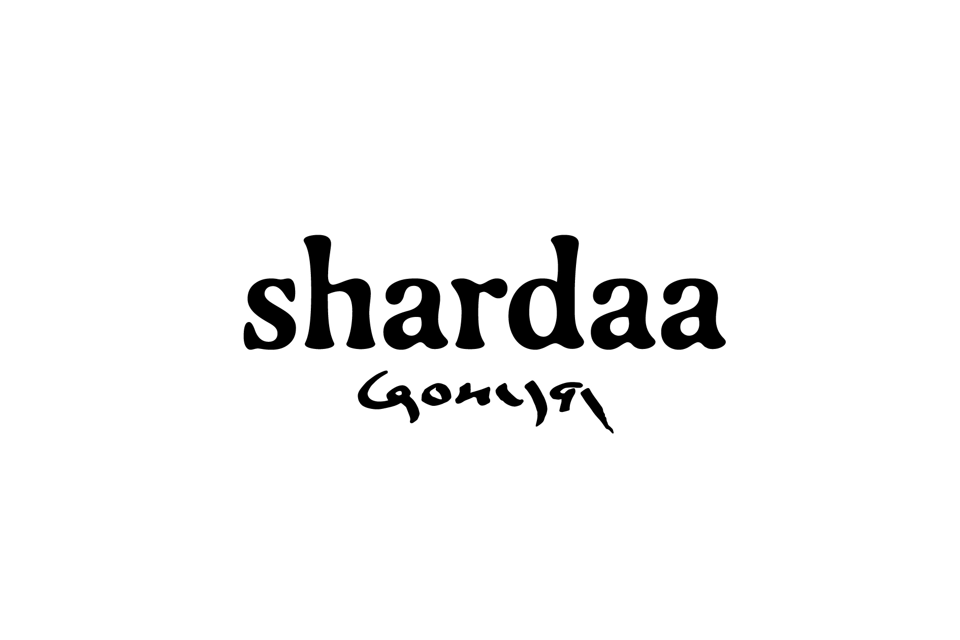
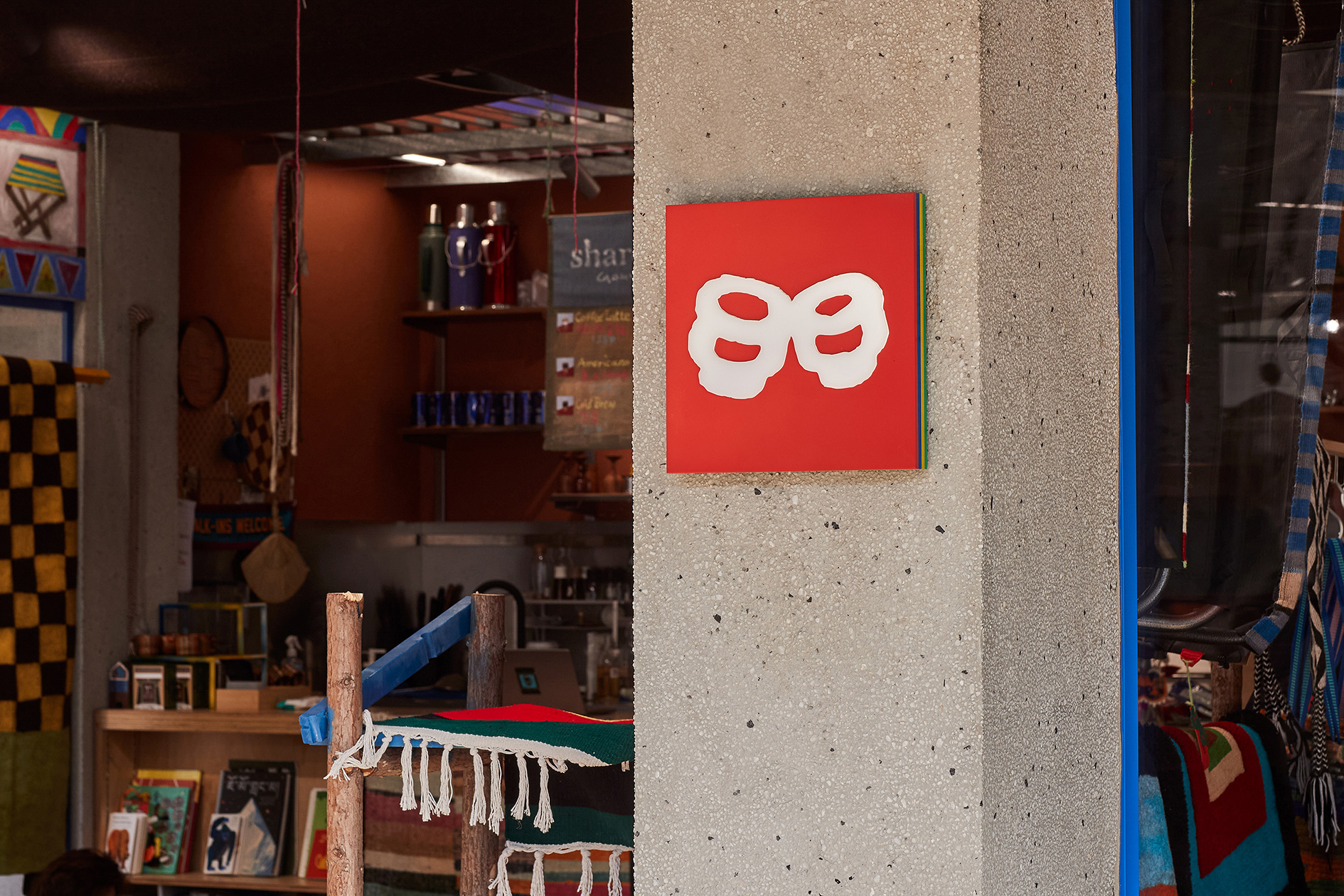
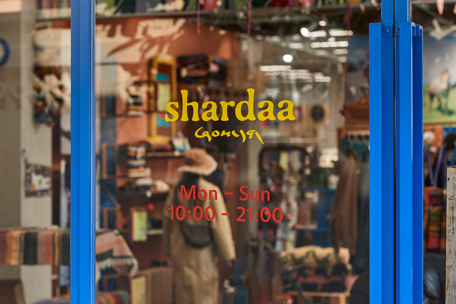
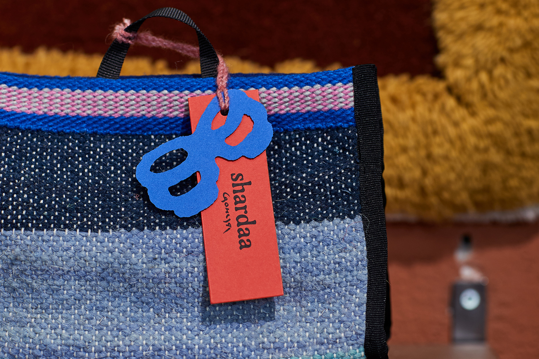
为 shardaa 塑造形象的过程,也不断让我们对高原产生想象。最终形成的字体标志有着古典的衬线字体骨架,外轮廓仿佛包裹着厚厚的毛皮,7 个字母如同一群款步而来的高原动物。同时我们也绘制了一个粗犷而鲜明的“干杯”图形,它看似不太精确,但又能带来浑然天成的感受。shardaa 同时也是多彩的:我们使用了大胆而高饱和度的拼色,来表现藏地热烈的生命力。
"Shardaa" is an emerging brand originating from the Himalayas, dedicated to merging the wisdom of highland living with modern innovative design concepts, introducing a dynamically evolving Tibetan culture to all. The name shardaa comes from the pronunciation of ཞབས་དག། (meaning 'cheers' in Tibetan), which signifies not only celebration, cooperation, and blessings but also intimate interactions between people and objects, people and people, and people and spaces.
The process of shaping shardaa’s identity continuously sparks our imagination of the highlands. The final wordmark carries the classical structure of a serif typeface, its outer contours resembling a thick fur coat. The seven letters stand together like a herd of highland animals moving gracefully across the terrain. Alongside this, we created a bold and rugged "cheers" symbol—imperfect in precision yet effortlessly organic in its expression.
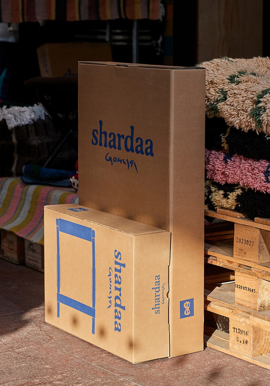
shardaa is also a brand of vibrant colors. We embraced bold, high-saturation color combinations to capture the passionate energy and vitality of Tibetan life.
Art Director: Tong Yi
Designer: Tong Yi / Duan Anran
Year: 2023
Client: Shardaa