Riso Type Poster
当香蕉鱼提出 Riso 海报的合作提议时,我们几乎当即答应下来:还有什么比这更合适的印刷工艺去展示 Quinsay Type 这几年设计的字体呢?
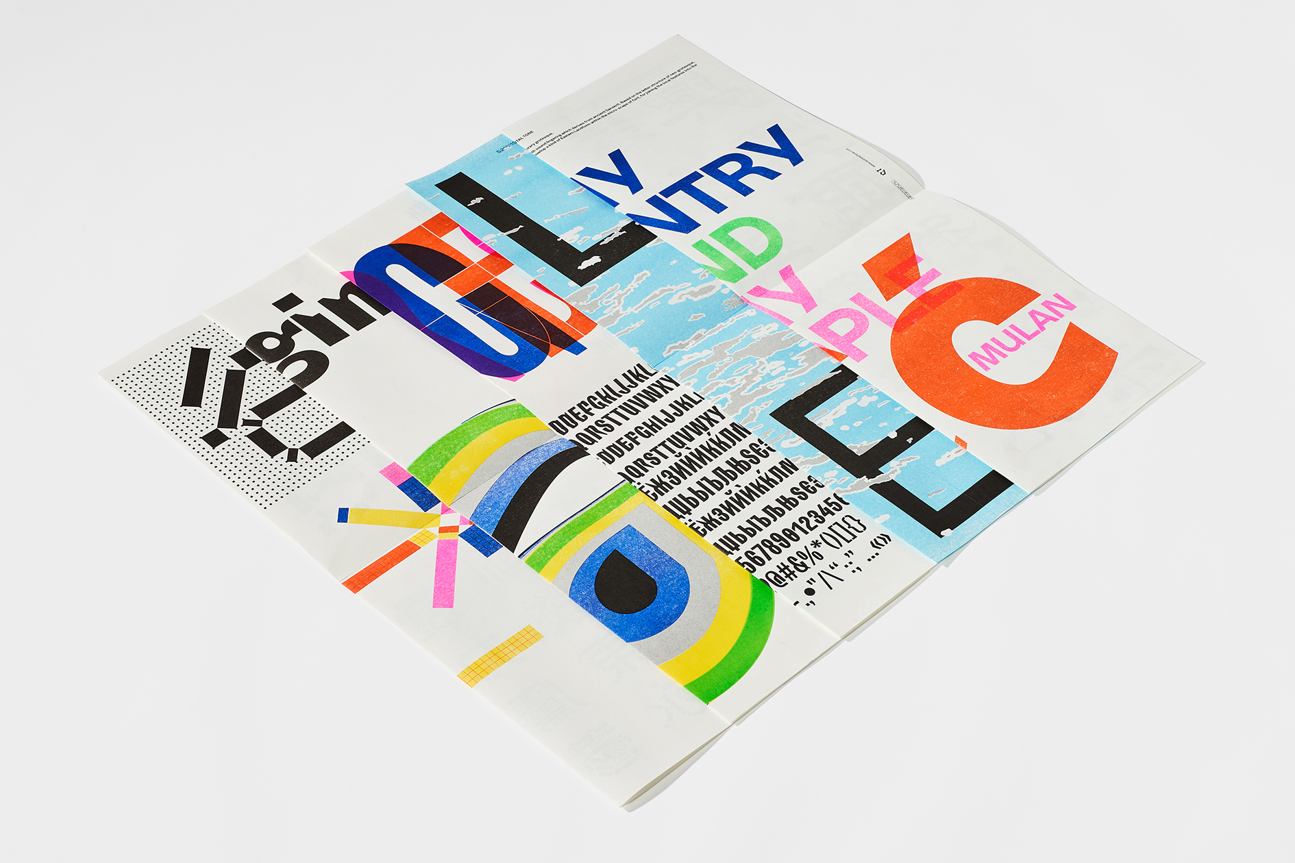
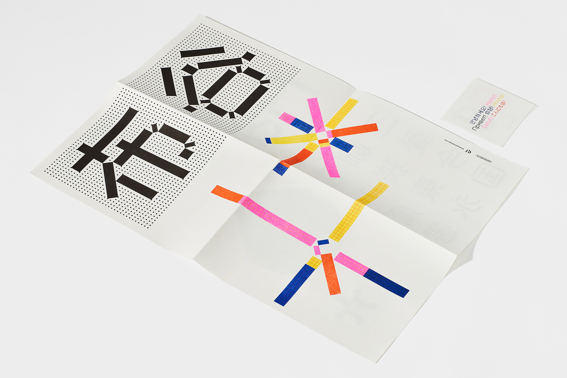
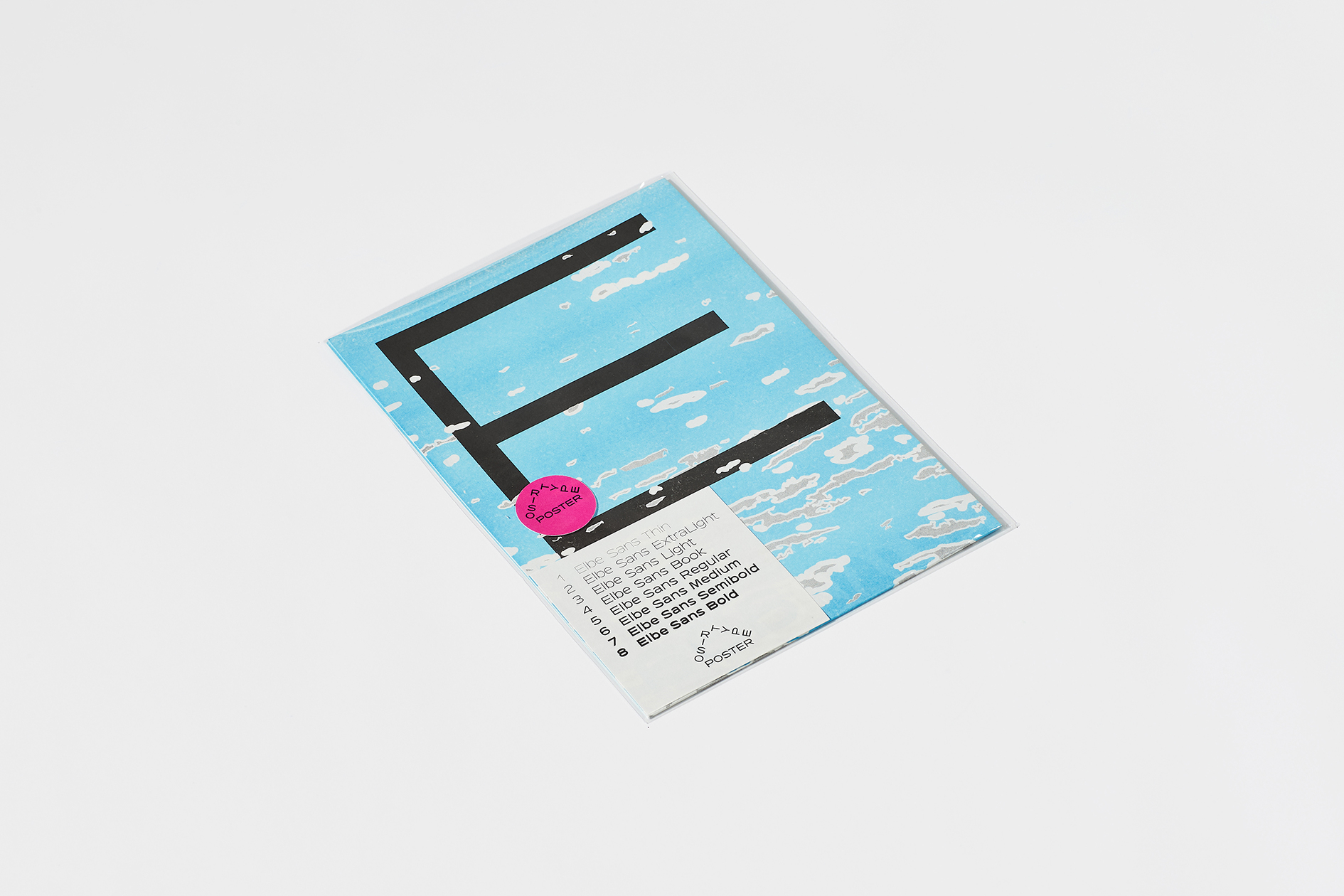
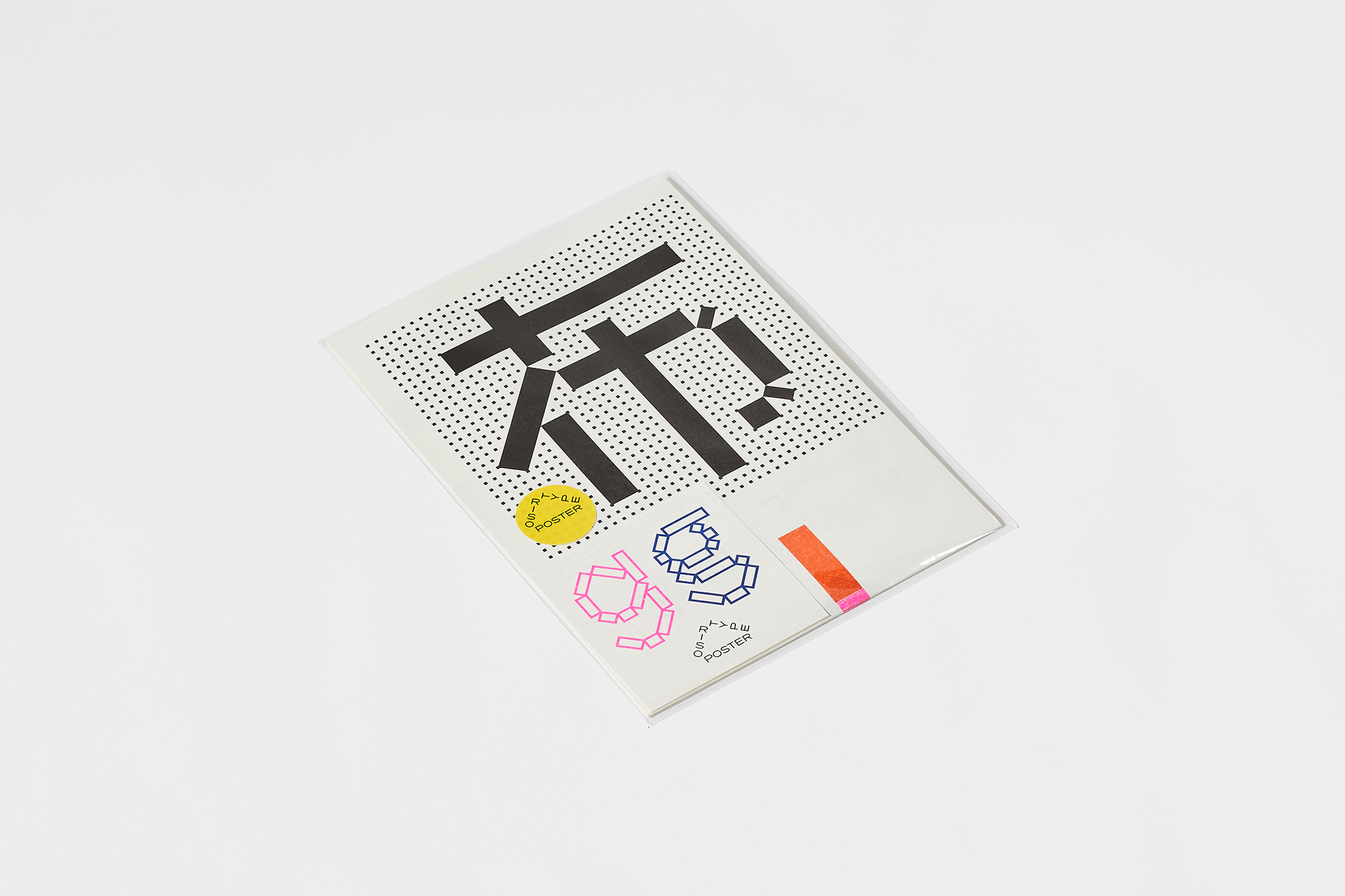
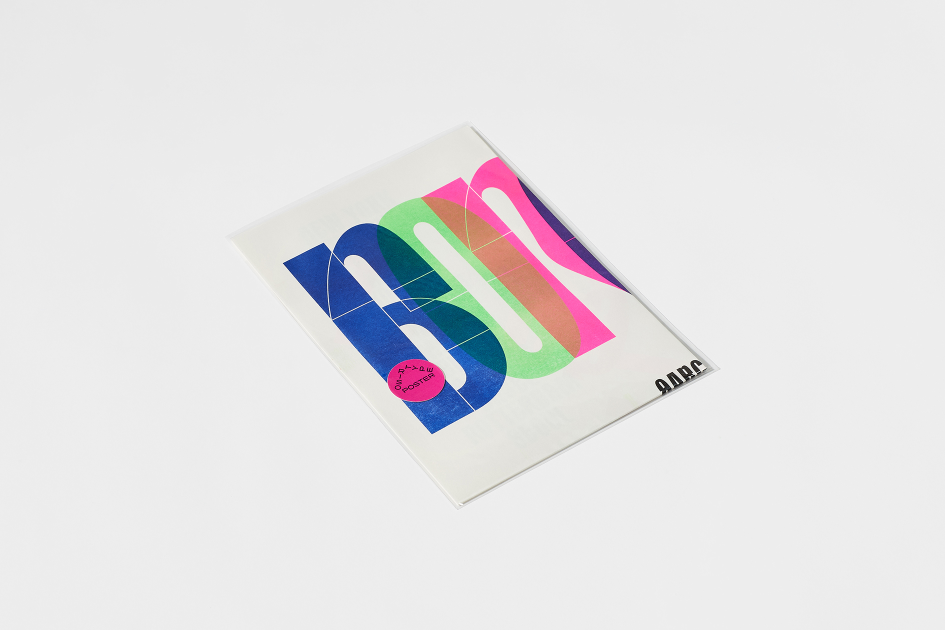
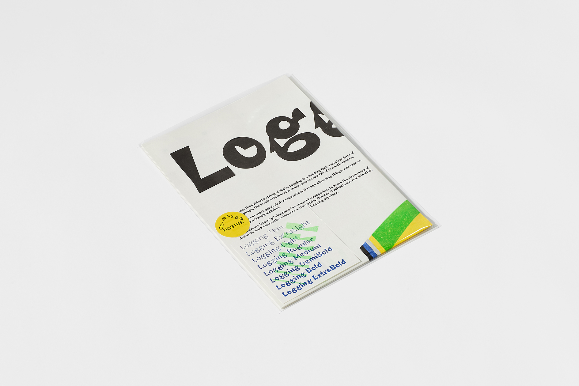
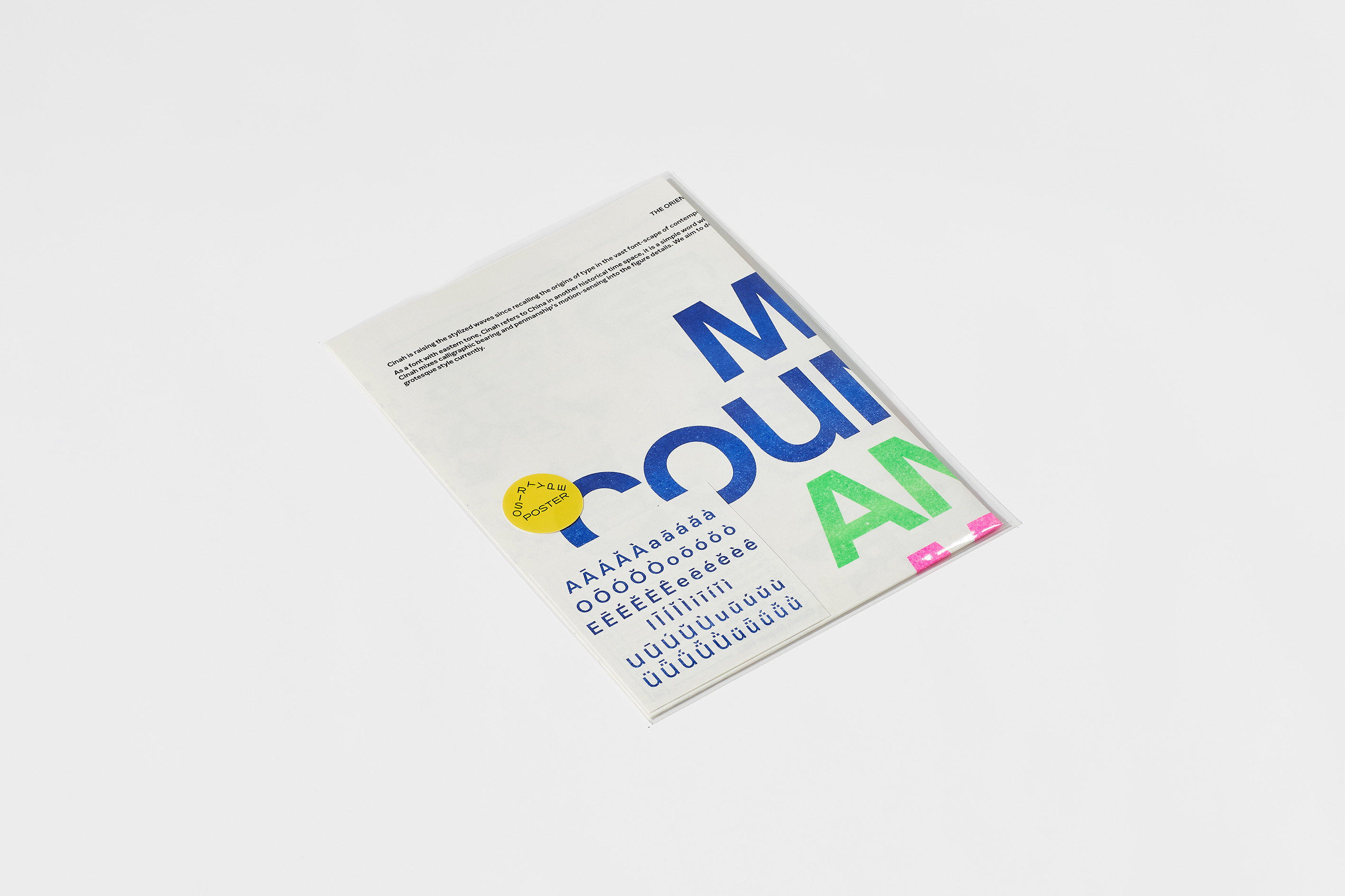
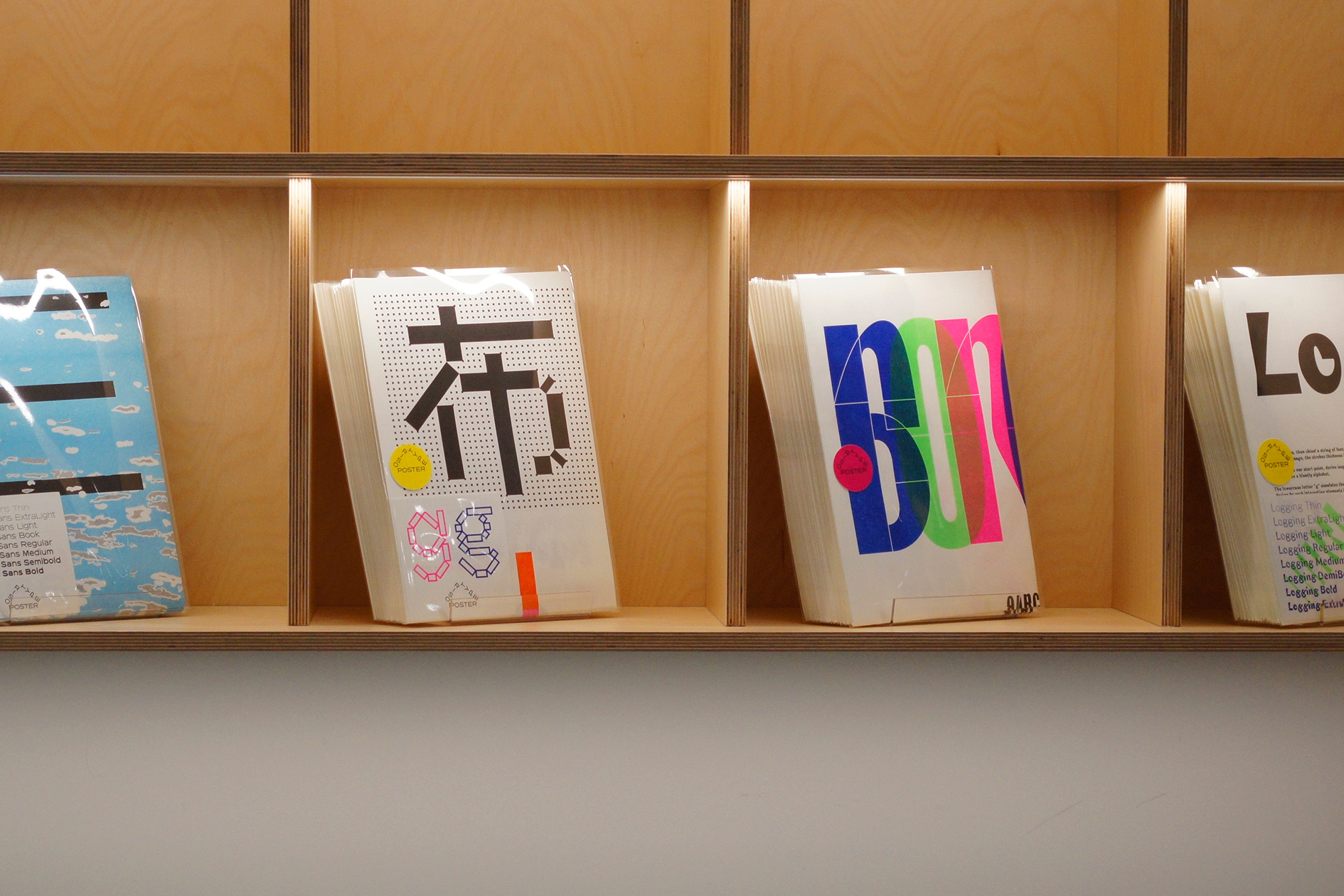
海报为字体提供了另一种非功能的、叙事的打开方式,而香蕉鱼的 Riso 印刷又为海报带来了独特的表现力;在设计海报的这段时间,我们不断回到平面最基础的原点,观察字母、词语和段落,思考形状的大小和位置,测试颜色与颜色的叠加,一边摸索,一边完成了 5 张字体海报(Elbe Sans、Lattice Letter & 格黑、BORGES、Logging、Cinah)。
看到这些海报的朋友们通常会面临一个提问:你最喜欢哪一张?在聆听他们的选择和描述时,仿佛有一根无形的线,连通了我们流动的感知。
When BANANAFISH proposed a collaboration on risograph posters, we immediately agreed: what better printing technique could there be to showcase the fonts designed by Quinsay Type over the past few years?
The poster offers an alternative, narrative approach to showcasing the typefaces, while BANANAFISH's risograph printing brings a unique expressiveness to the posters. Throughout the design process, we constantly returned to the fundamental aspects of graphic design, observing the letters, words, and paragraphs, considering the size and position of shapes, and experimenting with colors and their overlays. Through this exploration, we finally completed five posters (Elbe Sans, Lattice Letter & Grid Hei, BORGES, Logging, Cinah).
Friends who catch sight of these posters are often faced with a simple question: “which one is your favorite?” As we listen to their preferences and descriptions, it feels as if an invisible thread connects us, linking our fluid perceptions.
Art Director: Tong Yi
Designer: Tong Yi / Bao Sanchuan
Photographer: Li Xiaolong
Year: 2023
BANANAFISH × Quinsay Type