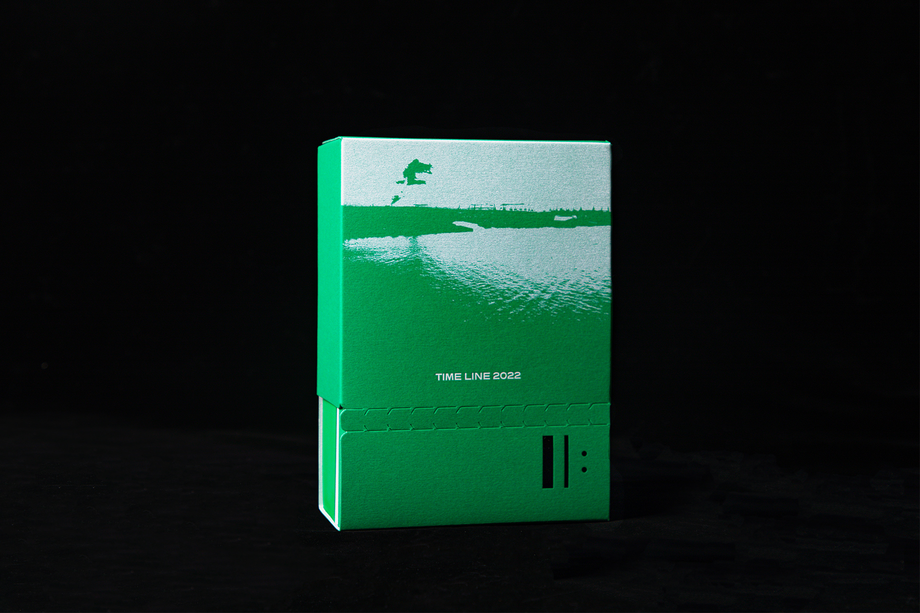
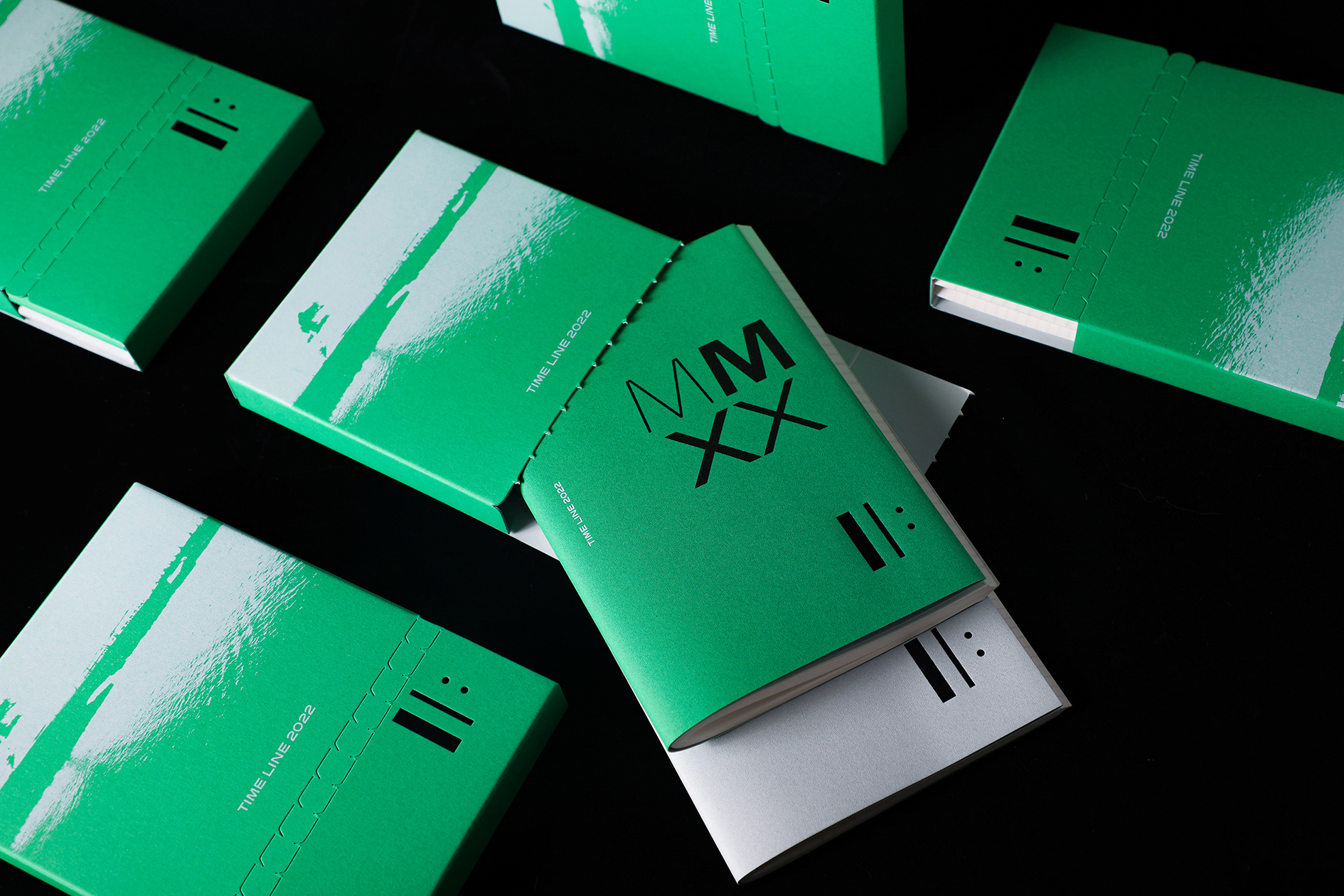
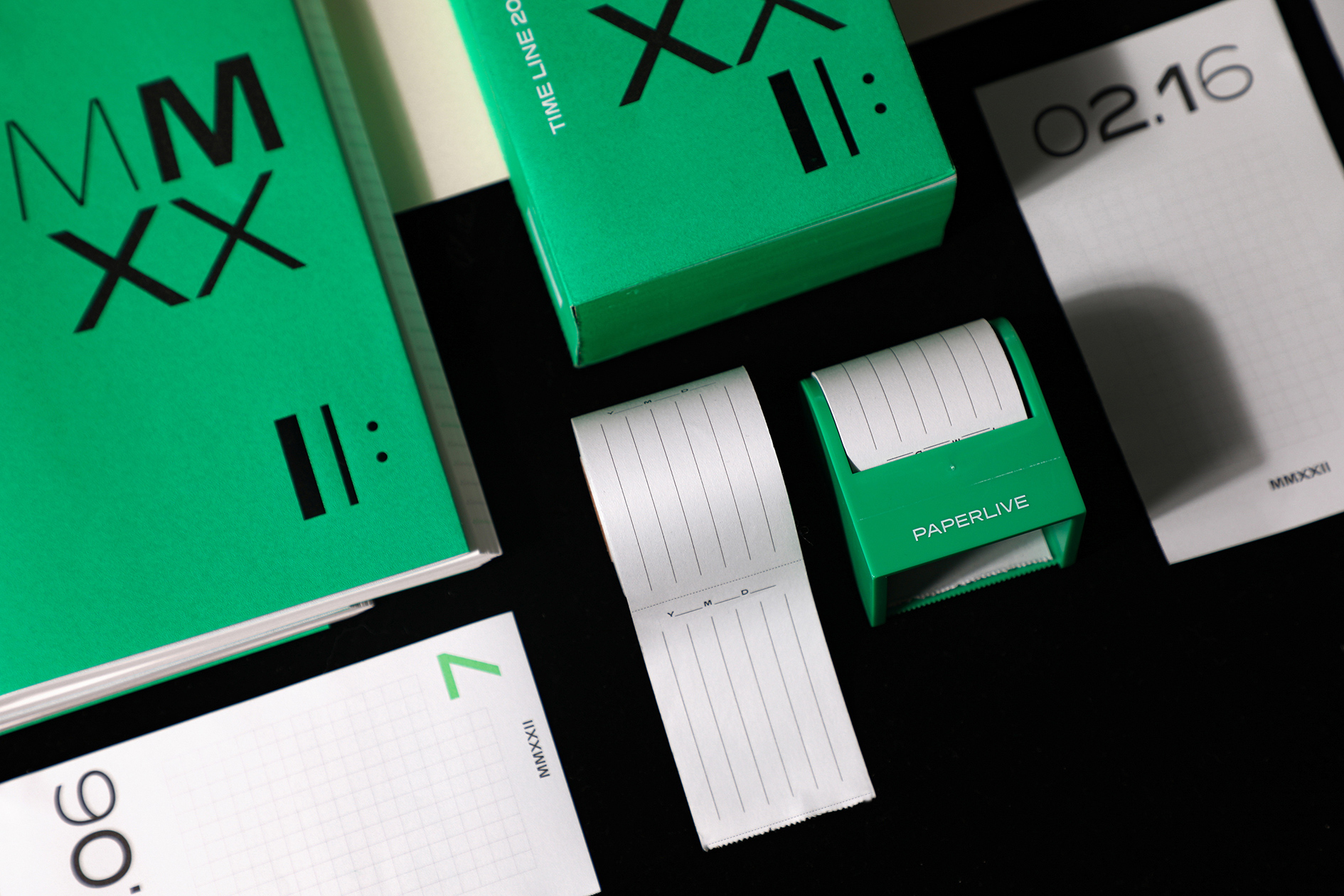
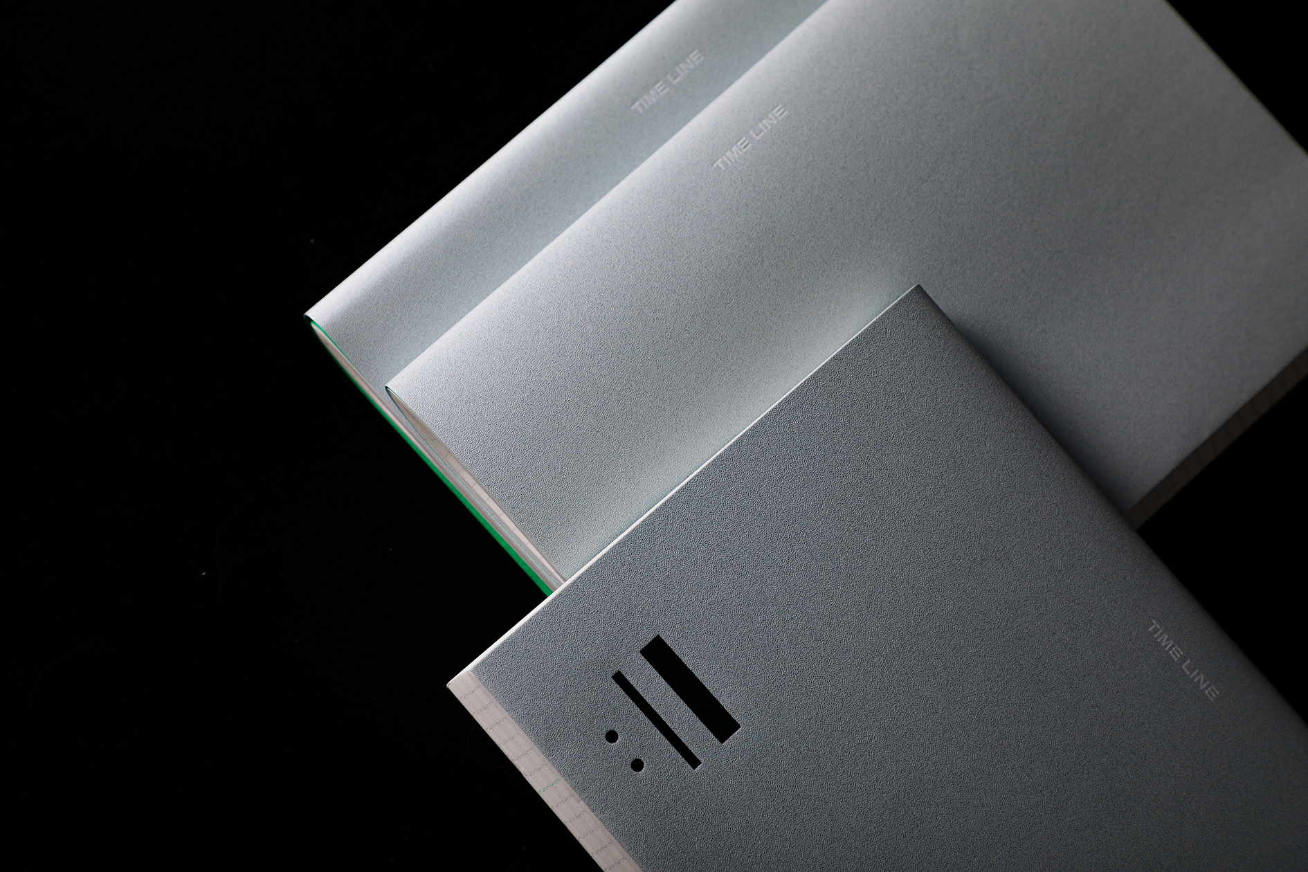
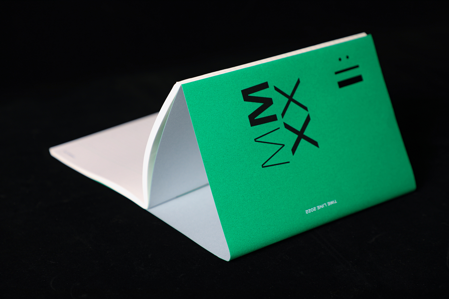
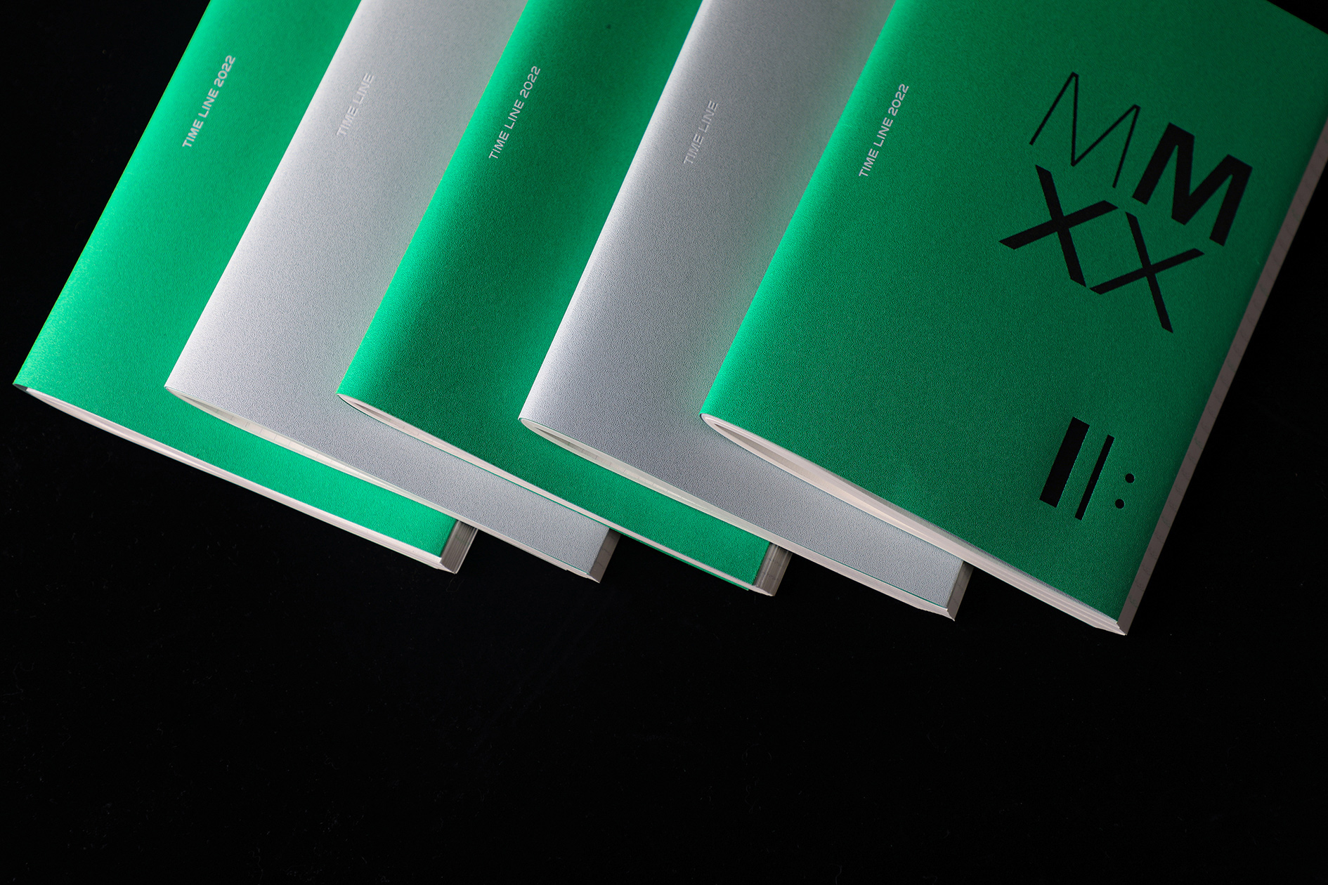
TIME LINE 2022
以多线叙事的形式,在「TIME LINE」这个剧场内发生交响,是qd设计「时间乐章」年历本想要实现的。
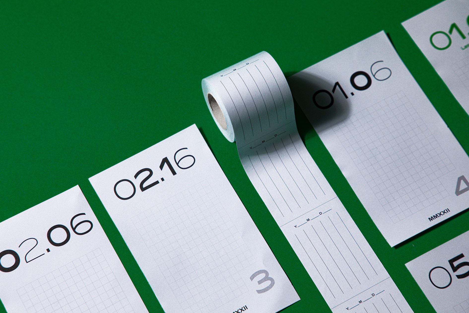
套装中使用了Elbe Sans这款得名于易北河的可变字体,每一张内文纸上的字体粗细、宽窄变化均匀——像河流一样蜿蜒行进,如同变幻的每一天。
封面和封底出现的符号II:是乐谱中的段落反复记号,表示中间的部分都将反复演奏——让笔记本上的记录串联后变成随时间流动的乐谱,一年中的12个月也会在下一年再次往复🎹。
A multi-line narrative that symphonizes within the theater of "TIME LINE" is what we wanted to achieve by designing the annual calendar.
Elbe Sans, a variable typeface named after the Elbe River, is used in the set, and the font varies evenly in thickness and width on each interior paper - meandering like a river, just like each day that changes.
The symbols that appear on the front and back covers are repeated notations of passages in the score, indicating that the middle sections will all be played over and over again - making the notes in the TIME LINE to be strung together and turned into a score that flows over time, with the 12 months of the year repeating themselves in the next.
Art Director: Tong Yi
Designer: Tong Yi / Sun Yijing
Photographer: Xu Yiting
Year: 2021
Client:纸现场