A Millet
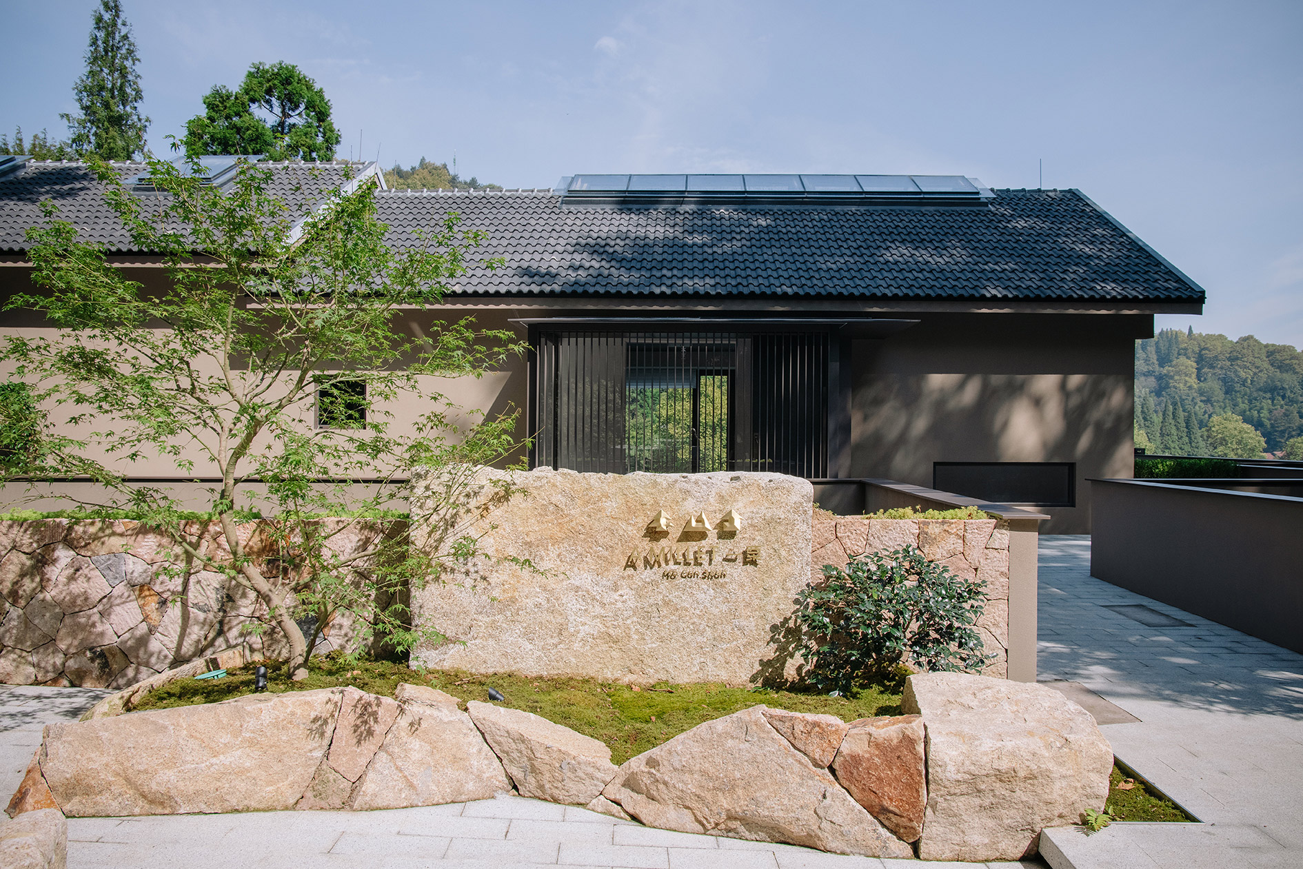
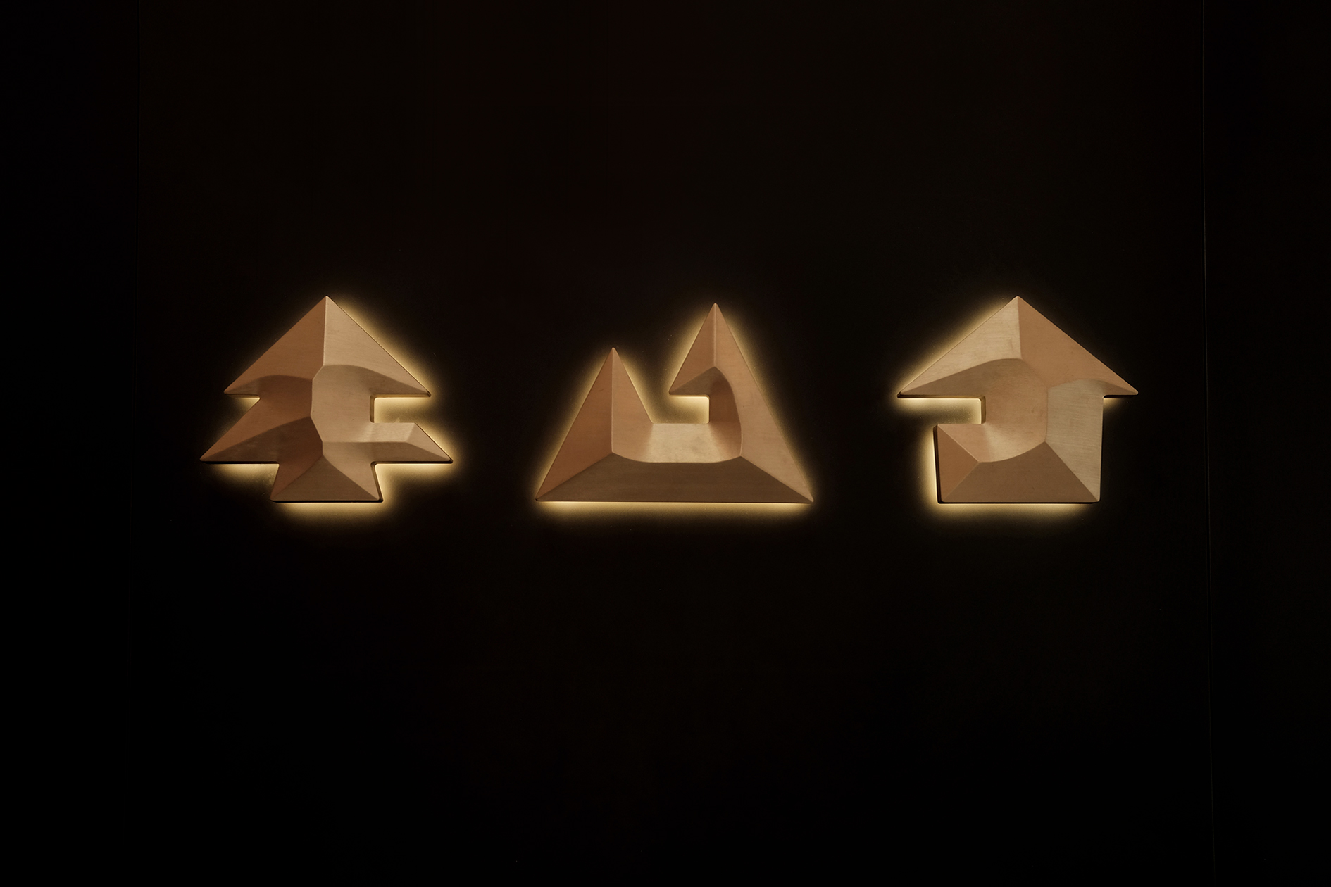
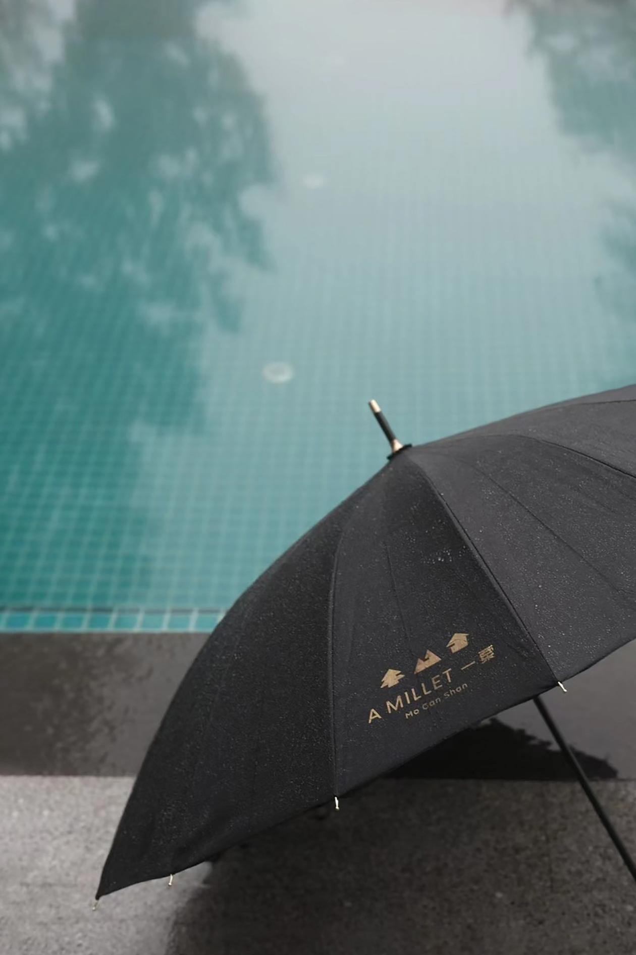
隐于莫干山的「一粟」名称取自苏轼《赤壁赋》中的“寄蜉蝣于天地,渺沧海之一粟”,由一栋老别墅和一栋现代建筑构成主体,拥有一片广阔的森林景观。
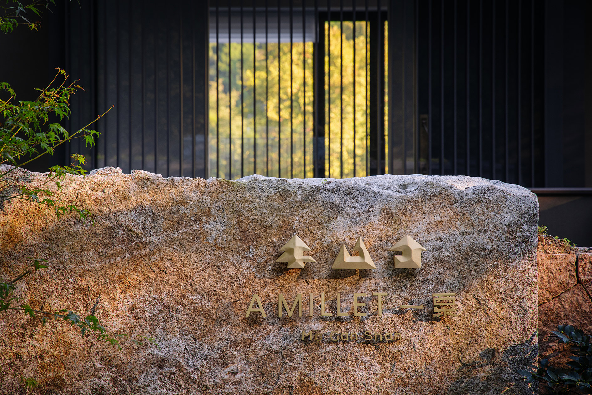
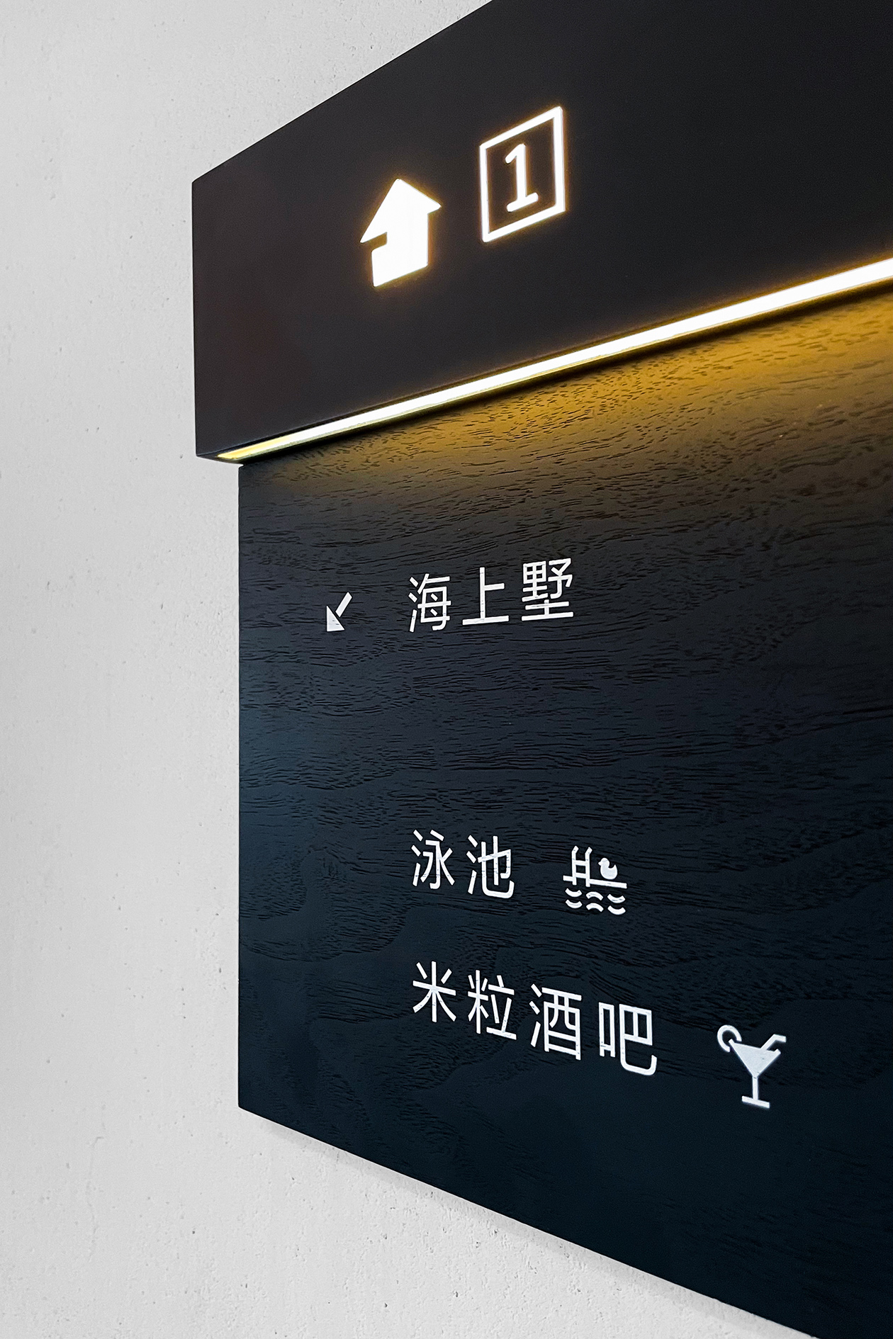
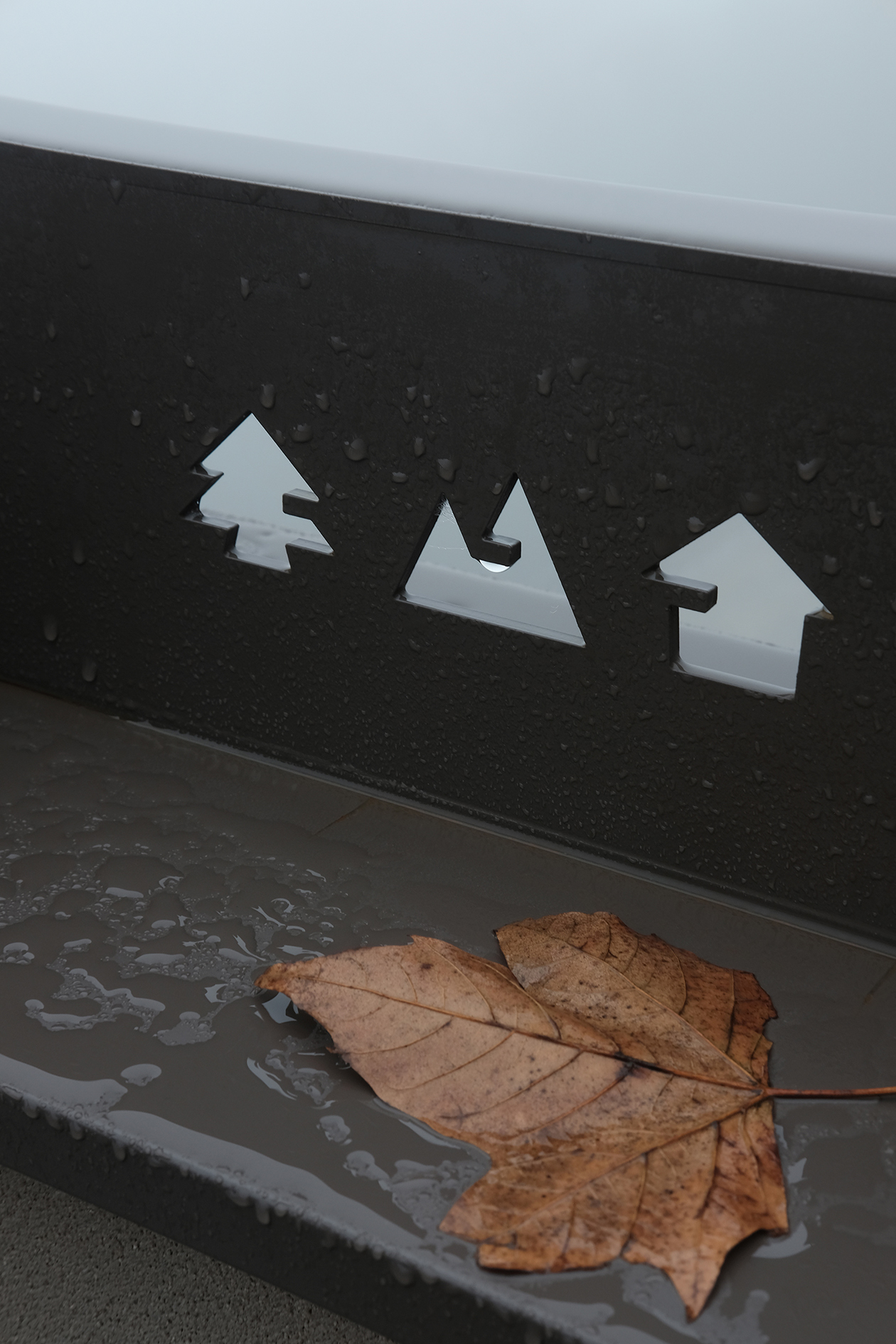
身处其中的人或建筑对于这个场域而言都是渺小的,嵌于建筑细节中的标识更是如此,所以我们想让平面设计在其中的角色也尽量谦卑而朴素。品牌形象从构筑起「一粟」的“宿、树、粟”出发,在logo图形中以“一”贯穿,串联起酒店与大自然的关联。
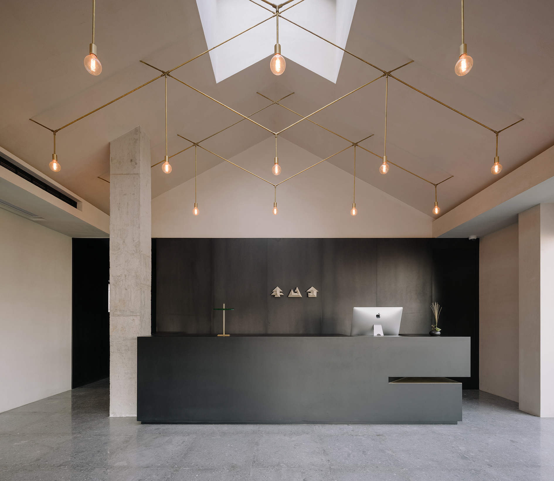
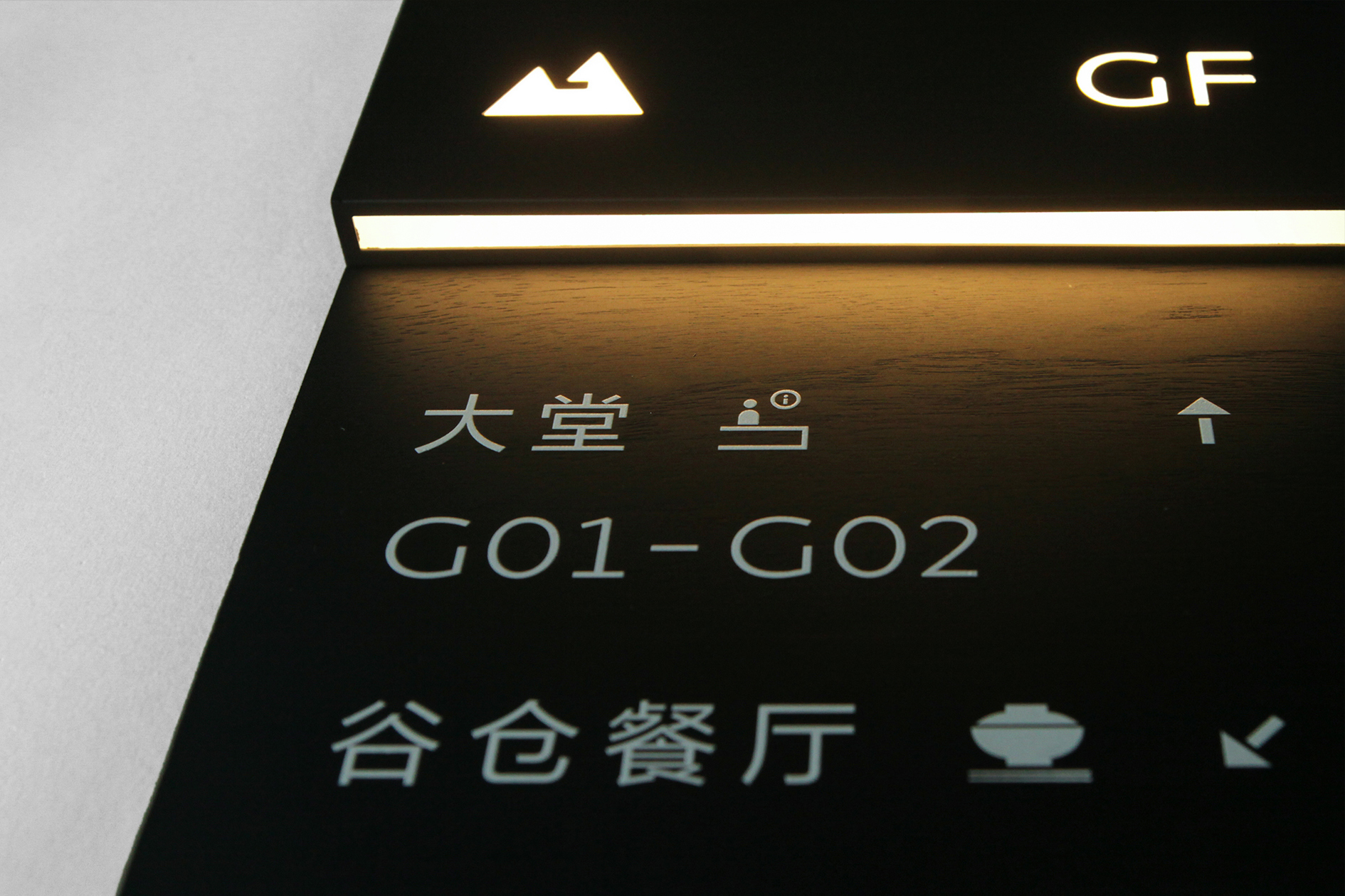
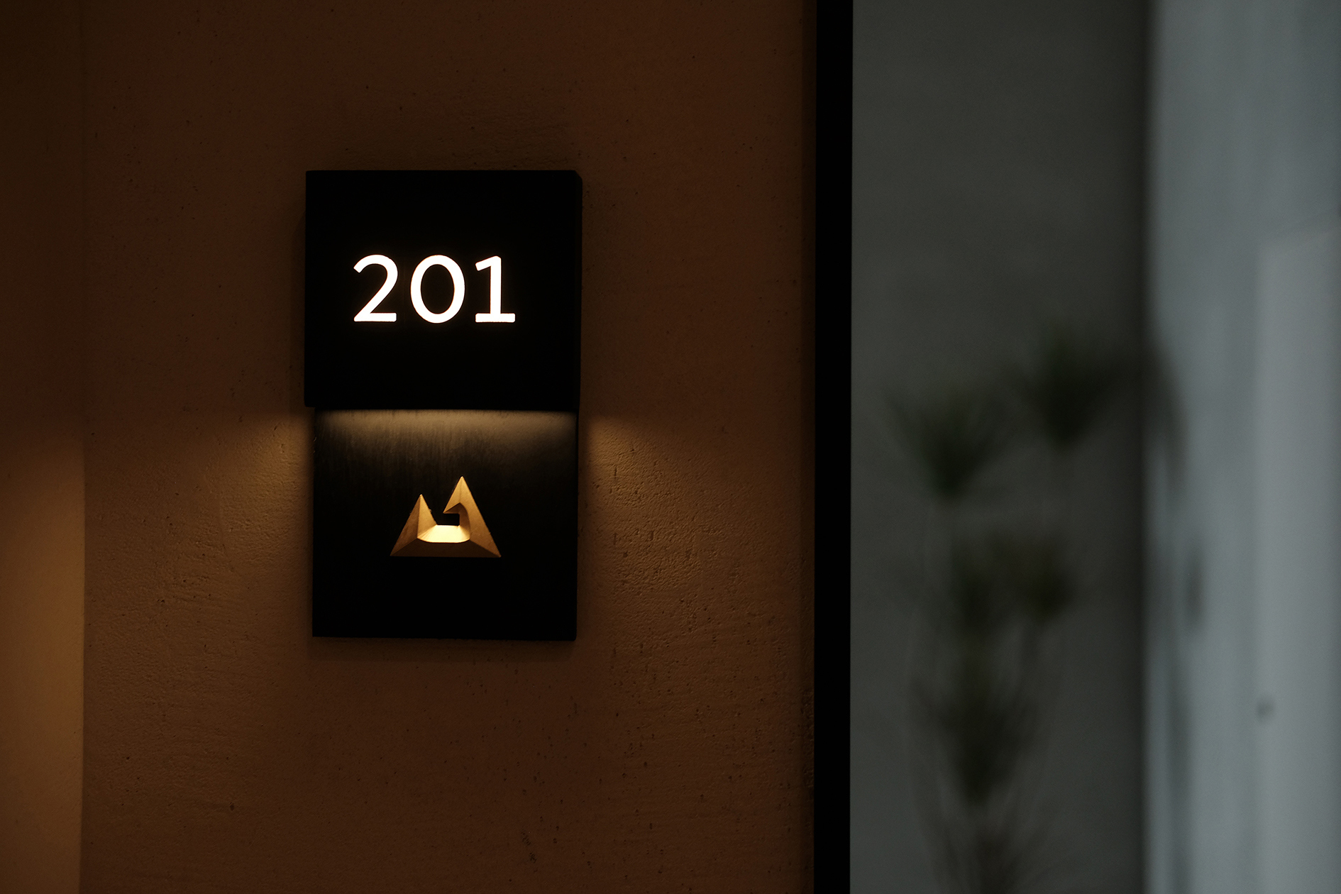
主体部分的导视都选用黄铜材质,因酒店附近就是让莫干山得名的“剑池”古迹,标识也带有古剑的形态。虽小而精,蕴含时间和古朴的力量。
Hidden in the Moganshan Mountains, A Millet consists of an old villa and a modern building in a vast forest landscape.
The people and buildings within it are small concerning the landscape, and the logo embedded in the architectural details is even smaller, so we wanted to make the role of graphic design as humble and unpretentious as possible. The brand image is based on the 'lodging, tree and corn', and the 'one' is used throughout the logo graphic to link the hotel to nature.
The main part of the signage is made of brass, and as the hotel is near the 'Sword Pond', the monument that gave Moganshan its name, the logo takes on the form of an ancient sword. Small but subtle, it embodies the power of time and antiquity.
Art Director: Tong Yi
Designer: Tong Yi / Huang Yiluan / Liu Xuan
Photographer: Tang Tang / Wen Studio
Year: 2020-2021
Client: A Millet
